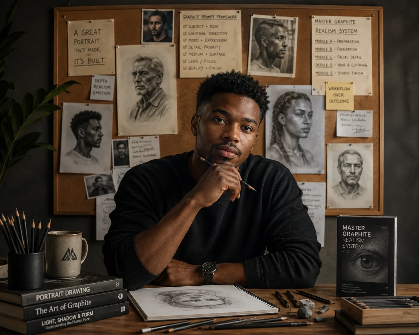
A deep, honest conversation about why the Portrait Rendering System is built the way it is, and how anyone can think like a prompt architect.
By Daramola Paul Imoleayo — Lightson Design Lab
Over the last few months, I have written a lot of words about the Portrait Rendering System. I have talked about the philosophy behind it, the material properties of graphite, and the mistakes that most AI prompts make. I have shared the system itself as a free PDF, and I have watched people download it and put it to use.
But there is one conversation I have not had yet. It is the conversation that people keep asking for. It is the conversation that happens when someone sits down with me and says, "Okay, you built this thing. But how did you actually build it? How did you know what to write? How did you decide what to put in and what to leave out?"
That is the conversation I want to have today.
This is not going to be a technical breakdown filled with buzzwords. I am not going to talk about machine learning layers or training data or neural network architectures. I am going to talk about the human decisions. The small, quiet moments when I sat in front of a blank page and tried to figure out how to tell a machine to make something that felt like it was made by a human hand.
This is the behind-the-scenes story of the PRS system. It is the story of how I learned to talk to AI not as a robot, but as a student who needed to be taught the rules of traditional drawing.
Where It All Started
The first time I ever typed the words "graphite portrait" into an AI image generator, I felt a wave of excitement. I had spent years learning how to draw with a pencil. I had spent countless hours studying the way graphite interacts with paper, the way pressure creates depth, and the way a single stroke can change the entire mood of a portrait. And now, suddenly, there was a machine that could do it in seconds.
But the excitement did not last long.
When the image appeared on my screen, I looked at it and felt nothing. It was gray. It was flat. It was a photograph that had been fed through some kind of digital filter. It did not look like a drawing. It looked like a screen capture from a cheap mobile application.
I remember staring at it and thinking, "This is not art. This is a simulation of art. And it is a very poor simulation."
At first, I thought the problem was with the AI itself. I thought the machine was not sophisticated enough to understand what a drawing is. But the more I experimented, the more I realized that the problem was not the machine. The problem was the way I was talking to it.
I was using the wrong words.
I was saying things like "make a pencil sketch" and "create a graphite portrait" and "turn this photo into a drawing." These are vague instructions. They do not tell the machine what a pencil stroke actually is. They do not tell it how graphite layers work. They do not tell it that a drawing is built from the ground up, starting with the structure of the skull and ending with the smallest highlight in the eye.
When you give vague instructions to a machine, you get vague results. It is the same as telling a human artist to "just draw something nice." Without specific guidance, they will default to whatever they know best, and they will not necessarily give you what you actually want.
I realized that if I wanted the AI to produce something that looked like a real graphite drawing, I had to teach it how to draw. I had to break down the entire process into tiny, specific, unambiguous steps. I had to write instructions that left no room for interpretation.
That is when I started building the Portrait Rendering System.
The First Realization: You Have to Start at the Very Beginning
When I sat down to write the first draft of the PRS prompts, I did not start with shading. I did not start with hair or clothing or facial features. I started with the very first thing that every artist does when they begin a portrait.
I started with the structure.
Before you can draw a face, you have to understand the skull. You have to understand the distance between the eyes, the curve of the jaw, the placement of the nose. Artists call this the construction phase. It is not glamorous. It is not exciting. But it is the single most important part of the entire drawing.
If you get the structure wrong, nothing else matters. The shading can be beautiful. The blending can be flawless. But if the eyes are too close together or the nose is too wide, the portrait will look uncanny. It will look like a distorted version of the person, and it will never truly feel real.
I knew that if I wanted the AI to create authentic portraits, I had to force it to go through this construction phase. I could not let it jump straight to shading. I had to make it start with the foundation.
That is why the very first instruction in the PRS Graphite Construction engine is about HB guidelines. It tells the AI to construct the portrait using light HB pencil strokes. It tells the AI to establish accurate proportions and major forms. It tells the AI that these construction marks should not be visible in the final image, but they should exist beneath the surface, holding everything together.
This instruction is the cornerstone of the entire system. Without it, the AI would skip the most important step. And without that step, the final image would never feel grounded in reality.
The Second Realization: You Cannot Skip the Layers
The next thing I learned was that AI has a terrible habit of jumping straight to the darkest shadows. When you ask a machine to render a shadow, it does not think about layering. It does not think about building up depth slowly. It simply applies a dark gray color and calls it done.
This is not how graphite works.
When a human artist creates a shadow, they start with a light layer of graphite. Then they add another layer. And another. And another. Each layer adds a little more depth, a little more richness, a little more complexity. The final shadow is not a single block of dark color. It is a dense, textured accumulation of overlapping strokes.
You can see the direction of the strokes if you look closely. You can see the way the graphite particles have settled into the paper fibers. You can see the slight variations in darkness that come from the natural pressure changes of the artist's hand.
This is what gives graphite its soul. This is what makes it look alive.
When I first started testing my prompts, I noticed that the AI was producing shadows that looked like ink blocks. They were deep and dark, but they were completely flat. There was no texture. There was no variation. There was no sense that they had been built up over time.
To fix this, I had to teach the AI about layering.
I wrote an instruction that forced the AI to progress through specific graphite grades in a specific order. I told it to start with HB. Then 2B. Then 4B. Then 6B. I told it never to jump directly to maximum darkness. I told it that every shadow should appear to have been built gradually, through repeated graphite application.
This single instruction changed everything. Suddenly, the shadows in the AI-generated portraits started to look like actual shadows. They had depth. They had texture. They looked like they had been drawn by a human hand.
I realized that this was the key to everything. The AI did not need to be smarter. It just needed to be given instructions that respected the physical properties of the medium. When you teach a machine about layering, you are not just giving it a rule. You are giving it a philosophy.
The Third Realization: Blending Is a Two-Step Process
One of the most challenging aspects of graphite drawing to explain to an AI is blending. In traditional drawing, blending is not a single action. It is a two-step process that requires two completely different tools and two completely different techniques.
The first step is broad blending. This is done with folded tissue paper. The artist gently rubs the tissue paper over large areas of the drawing, such as the cheeks, the forehead, and the chin. This smooths out the graphite, creating soft, gradual transitions between light and shadow. It is the step that gives the skin its smooth, natural appearance.
The second step is refined blending. This is done with a blending stump, which is a small, tightly rolled piece of paper that tapers to a point. The artist uses the stump to blend the smallest, most delicate areas of the drawing. The eyelids. The tear ducts. The bridge of the nose. The lips. The ear folds. The jaw transitions.
These two steps are completely different. They require different tools, different pressures, and different intentions. If you blend the entire portrait with a stump, it will look overly smooth and airbrushed. If you blend the entire portrait with tissue paper, it will look too soft and indistinct. You need both, and you need them in the right order.
When I initially wrote the blending instructions for the PRS system, I made a mistake. I simply told the AI to "blend the drawing." This was way too vague. The AI did not know whether to use tissue paper or a stump. It did not know which areas to blend and which areas to leave untouched. As a result, the blending in the generated images was inconsistent and unnatural.
I had to go back and rewrite the instructions with much greater precision. I separated the blending process into two distinct stages. Stage 4 of the PRS Graphite Construction engine is dedicated to broad tissue blending. It tells the AI to blend broad facial areas using folded tissue paper. It tells the AI to preserve the subtle direction of the graphite beneath the blending. And it warns the AI to avoid the airbrushed appearance that comes from over-blending.
Stage 5 is dedicated to refined blending with a blending stump. It specifically tells the AI to use a stump only for the eyelids, tear ducts, nose bridge, nostrils, lips, ear folds, and jaw transitions. And it explicitly tells the AI not to blend the entire portrait with a stump.
These two stages work together to create a natural, balanced blending effect. The broad tissue blending creates the soft transitions of the skin. The stump blending creates the sharp, precise edges that define the features of the face. Without both stages, the blending would either be too soft or too harsh. With both stages, it looks exactly like a traditional graphite drawing.
The Fourth Realization: The Eraser Is More Important Than the Pencil
If you ask most people what the most important tool in graphite drawing is, they will say the pencil. And they are not wrong. The pencil is the instrument that creates the image. Without it, there is no drawing.
But if you ask a professional graphite artist what the most important tool is, they might give you a different answer. They might tell you that the eraser is actually more important. And they would have a point.
The eraser in graphite drawing is not a tool for fixing mistakes. It is a tool for creating light. When you press a kneaded eraser into a darkened area of the drawing, you are not removing graphite. You are lifting it. You are exposing the pristine white paper beneath the layers of carbon. You are reclaiming the light.
This is how highlights are created in a graphite portrait. The artist does not paint white highlights onto the drawing. The artist lifts the graphite away to reveal the white paper underneath. This is a subtractive process, not an additive one.
The difference between these two approaches is huge. When you add white paint to a drawing, it sits on top of the graphite. It looks like a layer of paint. It does not look like it belongs to the paper. When you lift graphite to reveal the paper underneath, the highlight is physically integrated with the surface of the drawing. It looks like it belongs there, because it does.
When I started testing the PRS system, I noticed that the AI was creating highlights that looked unnatural. They were glowing and luminous, which would be great for a digital painting, but they looked completely out of place in a graphite portrait. I realized that the AI was painting white pixels on top of the image instead of lifting the graphite to expose the paper.
I had to teach the AI the difference between painting white and erasing to reveal white. I added an instruction to Stage 8 of the Graphite Construction engine. It tells the AI to recover highlights using a kneaded eraser. It tells the AI never to paint white highlights. And it tells the AI to preserve untouched Bristol board wherever possible.
This instruction transformed the highlights in the generated portraits. They became crisp, natural, and physically integrated with the paper. They looked like they had been created by a hand holding an eraser, not by a machine painting pixels.
The Fifth Realization: Charcoal Is a Special Guest
Graphite is an incredible medium, but it has one limitation. It is not truly black. Graphite is a dark gray color, and even the softest 6B graphite leaves a slightly reflective, metallic gray mark on the paper. This is beautiful, but it is not the deepest black possible.
For the deepest, richest blacks, artists turn to charcoal. Charcoal is a different material entirely. It is made from burned organic matter, and it produces a matte, velvety black that absorbs light rather than reflecting it. When you add a touch of charcoal to a graphite drawing, it creates a stark, dramatic contrast that pulls the viewer's eye into the deepest shadows.
But there is a risk with charcoal. It is very difficult to control. If you use too much charcoal, it will overwhelm the graphite and turn the drawing into a charcoal drawing. The subtle texture of the graphite will be lost.
In the PRS system, I had to find a balance. I needed the AI to use charcoal, but I needed it to use it sparingly. I added an instruction to Stage 7 of the Graphite Construction engine. It tells the AI to reserve soft charcoal only for the deepest accents. It gives specific examples: pupils, upper lash lines, deep nostril shadows, deep beard shadows, dark hair recesses, and selected clothing accents. And it includes a crucial warning: graphite must remain the dominant medium.
This instruction is one of the most important in the entire system. It ensures that the AI does not overuse charcoal. It ensures that the final image remains a graphite drawing, with just a hint of charcoal to add depth and drama. If you look closely at the portraits generated by the PRS system, you will see that the charcoal is present, but it is subtle. It is a quiet guest, not the main character.
The Sixth Realization: The Negative Prompt Is the Invisible Foundation
Most of the PRS system is about telling the AI what to do. But there is another side to it as well. There is a side that tells the AI what not to do. This is the negative prompt.
The negative prompt is one of the most overlooked aspects of AI art generation. When you write a prompt, you naturally focus on the things you want to see. You describe the subject, the medium, the lighting, the mood. You pour all of your energy into telling the AI what to create.
But you also need to tell the AI what to avoid. If you do not, the AI will default to whatever it has learned from its training data, and it will often include elements that you never intended. It might add a background that does not belong. It might apply a texture that feels digital. It might distort the anatomy of the subject.
The negative prompt is your safety net. It is the list of things that you explicitly forbid the AI from generating. It sounds counterintuitive to spend so much energy on what you do not want, but it is often just as important as describing what you do want.
When I sat down to write the negative prompt for the PRS system, I did not just write a few words. I wrote a comprehensive list of everything that could possibly go wrong. I spent hours thinking about every single element that might ruin a graphite drawing, and I wrote them all down.
I wrote about photographs, because I did not want the AI to generate a grayscale photograph instead of a drawing. I wrote about pencil filters and sketch filters, because I did not want the AI to apply a digital filter to the image. I wrote about digital painting and CGI, because I did not want the AI to generate something that looked like it was made on a computer.
I wrote about watercolor, oil painting, ink illustration, pastel, comic style, and anime. These are all beautiful mediums, but they are not graphite. And I wanted the AI to generate graphite, not anything else.
I wrote about photographic pores, camera reflections, plastic skin, and artificial sharpening. These are the hallmarks of AI-generated art, and I wanted to eliminate them completely. I did not want the skin to look like a photograph. I did not want it to look like plastic. I wanted it to look like graphite on paper.
I wrote about repeating textures, digital cross-hatching, and fabric grids. These are the digital artifacts that make AI-generated drawings look fake. I wanted to make sure that none of them appeared in the final image.
I wrote about lens blur and vignette. These are photographic effects, and they have no place in a graphite drawing.
I wrote about compression artifacts. I did not want the image to look like it had been compressed into a low-quality JPEG. I wanted it to look like a high-quality, pristine drawing.
And finally, I wrote about the things that affect the identity of the subject. I wrote about changed identity, altered hairstyle, altered clothing, added accessories, and invented facial features. These are the things that make an AI-generated portrait look like a different person than the one in the reference photo. And I did not want that to happen.
The negative prompt in the PRS system is long. It is comprehensive. And it is absolutely essential. Without it, the AI would have far too much freedom, and it would inevitably generate elements that undermine the authenticity of the final image. With it, the AI is constrained to the medium of graphite, and it is forced to stay true to the subject.
The Seventh Realization: The Quality Check Is Not an Afterthought
At the very end of the PRS system, there is a section that many people overlook. It is called the Quality Verification Engine. It is not a creative stage. It does not tell the AI to draw anything. It does not tell the AI to blend or layer or erase. It simply tells the AI to check its own work before finalizing the image.
This section was not an afterthought. It was one of the most carefully considered parts of the entire system. I knew that no matter how good the creative instructions were, the AI would occasionally make mistakes. It would occasionally generate something that looked off. And I knew that I needed a way to catch those mistakes before they became the final image.
The Quality Verification Engine is a checklist. It asks the AI to verify that the subject is immediately recognizable as the uploaded person. It asks the AI to verify that the facial identity has been preserved exactly. It asks the AI to verify that the artwork demonstrates layered graphite construction rather than photographic grayscale. It asks the AI to verify that the graphite direction remains visible in the hair, eyebrows, eyelashes, and facial hair. It asks the AI to verify that tissue blending is evident across large tonal transitions. It asks the AI to verify that highlights are created through preserved white paper and kneaded eraser lifting. It asks the AI to verify that clothing is rendered with traditional graphite values rather than digital texture. And it asks the AI to verify that the background is seamless white Bristol board.
This checklist serves two purposes. First, it encourages the AI to evaluate its own output critically. When the AI is forced to ask itself these questions, it is more likely to generate an image that meets all of the criteria. Second, it gives the user a way to assess the final image. If the user looks at the generated portrait and can answer all of these questions in the affirmative, they can be confident that the image is authentic.
The Quality Verification Engine is not a magical fix. It cannot guarantee that every image will be perfect. But it shifts the focus of the entire system from generating an image to verifying an image. It adds a layer of accountability that is missing from most AI prompting systems.
What I Learned About Writing for AI
Building the PRS system taught me a lot about writing for AI. But the most important lesson was not technical. It was philosophical.
Writing for AI is not about tricking the machine into doing what you want. It is about teaching the machine to understand what you want. It is about breaking down complex ideas into simple, unambiguous instructions. It is about being patient and specific and precise.
When you write a prompt, you are not just telling a machine what to do. You are having a conversation with it. You are sharing your knowledge, your experience, and your perspective. You are teaching it to see the world the way you see it.
This is a deeply human act. It requires empathy, creativity, and a willingness to meet the machine where it is. It requires you to think about what the machine knows and what it does not know, and to bridge that gap with clear, patient communication.
The Portrait Rendering System is not a perfect system. It is not the final word on AI-generated graphite drawing. It is a step forward. It is a contribution to a conversation that is still unfolding. And I hope that by sharing how I built it, I can help other creators build their own systems, their own frameworks, their own ways of teaching machines to make art that feels human.
"When you write a prompt, you are not just telling a machine what to do. You are having a conversation with it. You are sharing your knowledge, your experience, and your perspective."
A Final Word
If you have read all of this, you probably have a question. You might be wondering why I am giving all of this away for free. Why would someone spend months building a system, writing a book about it, and then just letting anyone download it for nothing?
The answer is simple. I believe that the best tools are shared tools. I believe that when you give someone the knowledge they need to create something beautiful, you are not diminishing your own work. You are adding to it. You are contributing to a culture of creativity and craftsmanship that extends far beyond any single individual.
The Portrait Rendering System is not my property. It is a set of ideas that I have collected and structured and shared. Anyone is free to take those ideas and build on them. Anyone is free to make them better. And I hope they do.
Because the conversation is not finished. The system is not finished. And the future of AI-powered art is still being written, one prompt at a time.
Download the Free 35-Page PRS Toolkit
Get the complete, unabridged stage-by-stage prompt system. Learn exactly how to build authentic graphite portraits with ChatGPT and Midjourney.
Get Your Free PDF
Comments
No comments yet. Start the conversation.